


Iconography
Format: Digital / Country: USA
Research has shown that good icons can enhance usability, be easily remembered, and improve the overall design.
With many modalities and programs provided by VA Telehealth, I noticed that there is an opportunity to improve the icons used in our deliverables. I took the initiative to experiment and propose custom icons to give individual programs personalities while keeping consideration of VA Telehealth’s branding guidelines.
While working on developing icons, I asked myself,
Individually:
Is the icon clear and simple?
Are they effective?
Does it have a personality?
As a set:
What mood does it create?
What makes it unique?
What does it say about the campaign/deliverable?
(If needed) is it scalable?
I am very grateful that the proposals were welcomed by our team and the client!
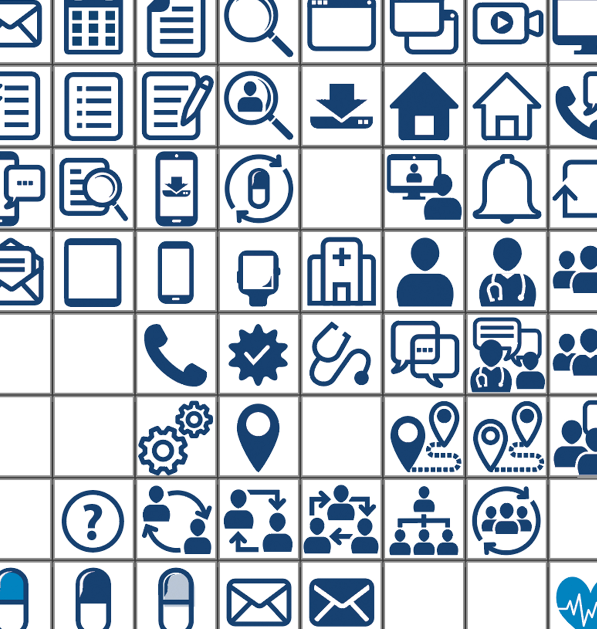
1. Instructional Course
VistA Integrated Training is a course to relay and demonstrate technical knowledge to VA employees. The training went through a complete redesign and I initiated a custom set of icons that complement the new polished personality.
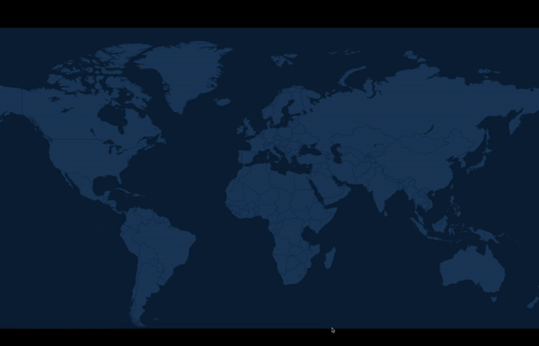
︎︎︎The basic shapes of the icon were inspired by the menu bar shown on the left of this picture.
Sample of the icons applied in the training.
Sample of the icons applied in the training.
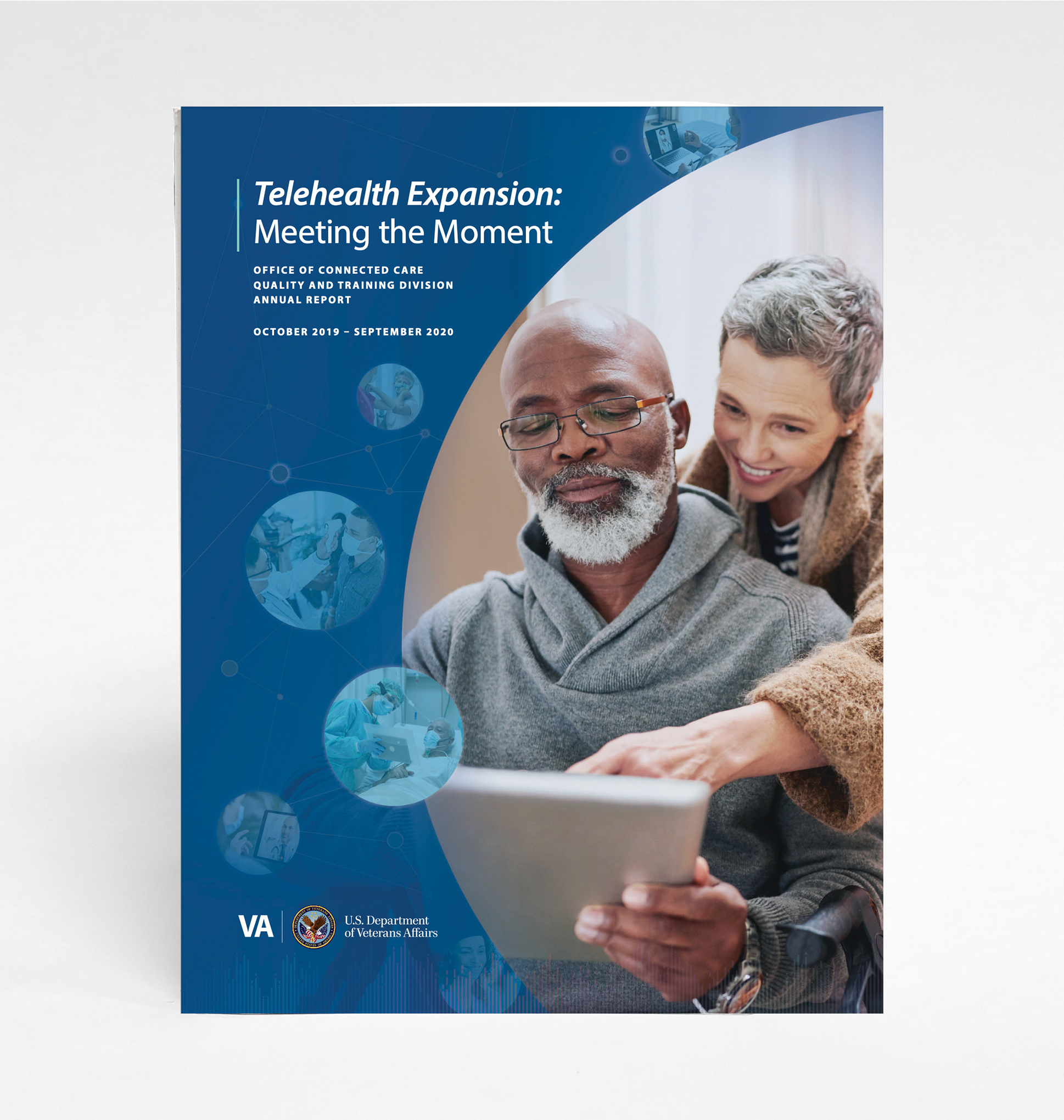
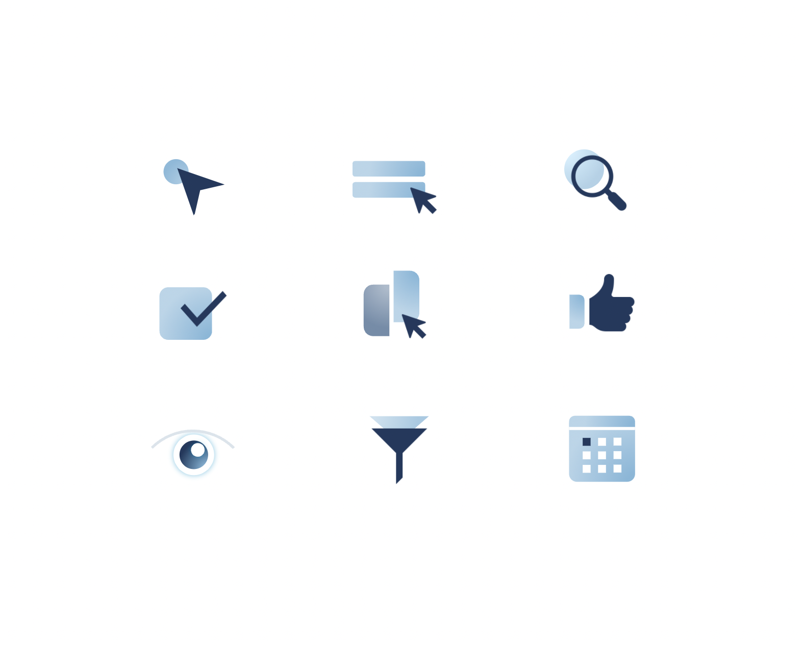
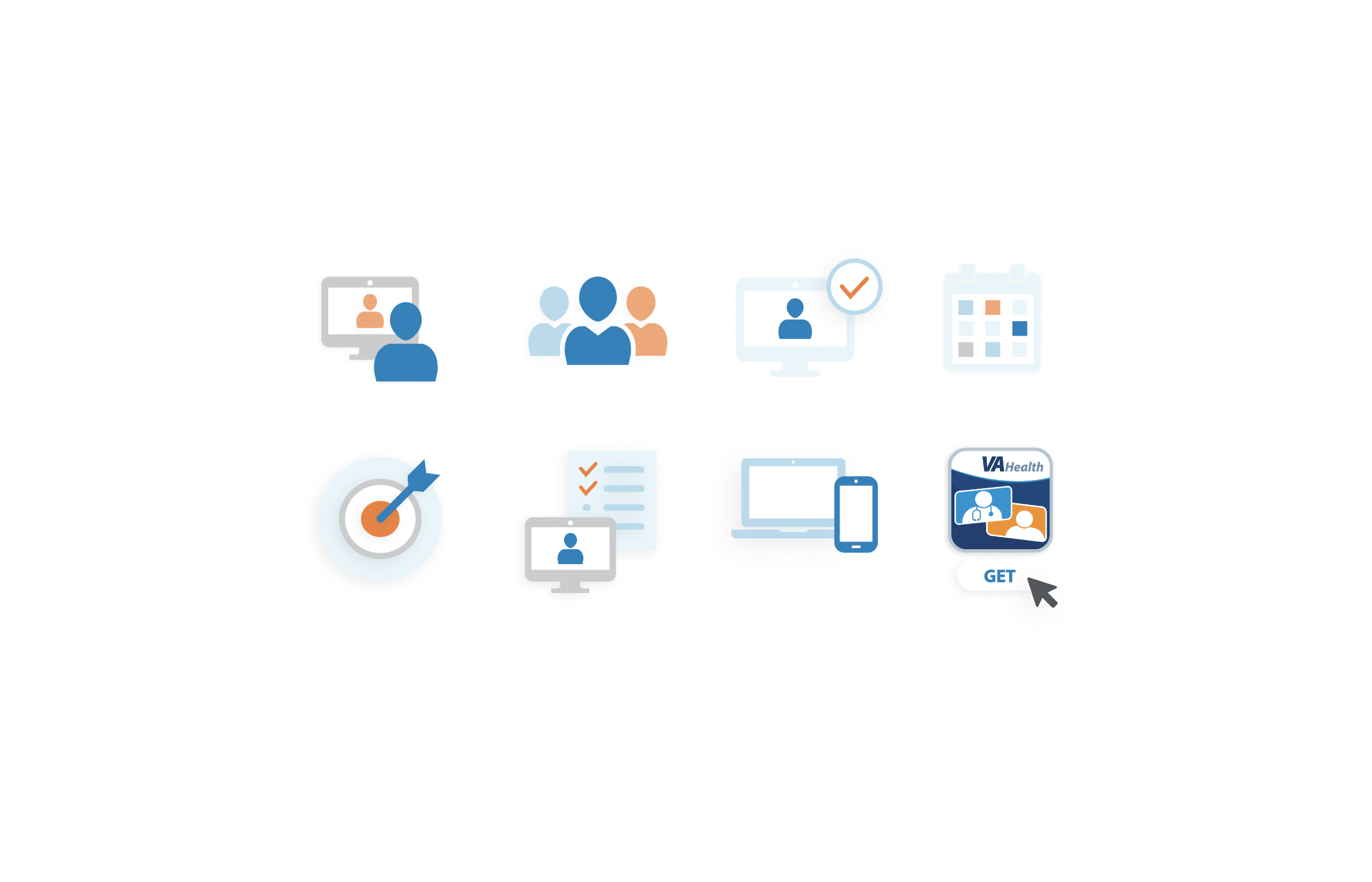
2. Report
Telehealth Certificate Program is a program made happen by a special partnership of the U.S. Department of Veterans Affairs with the University of Florida.
Our team created an annual report with an insert to promote the launch of their new certificate program for telepresenters. After establishing a style, I crafted a small cohesive set of simple icons, using the annual report’s tertiary color green as an accent.

︎︎︎Stages of an icon from left to right: Icon can be simplified for smaller applications; Icon at its original state; Icon elaborated with more details and complexity; A combination of two icons, as an illustration, to pull the viewer in by telling a short story of its own without reading any content.

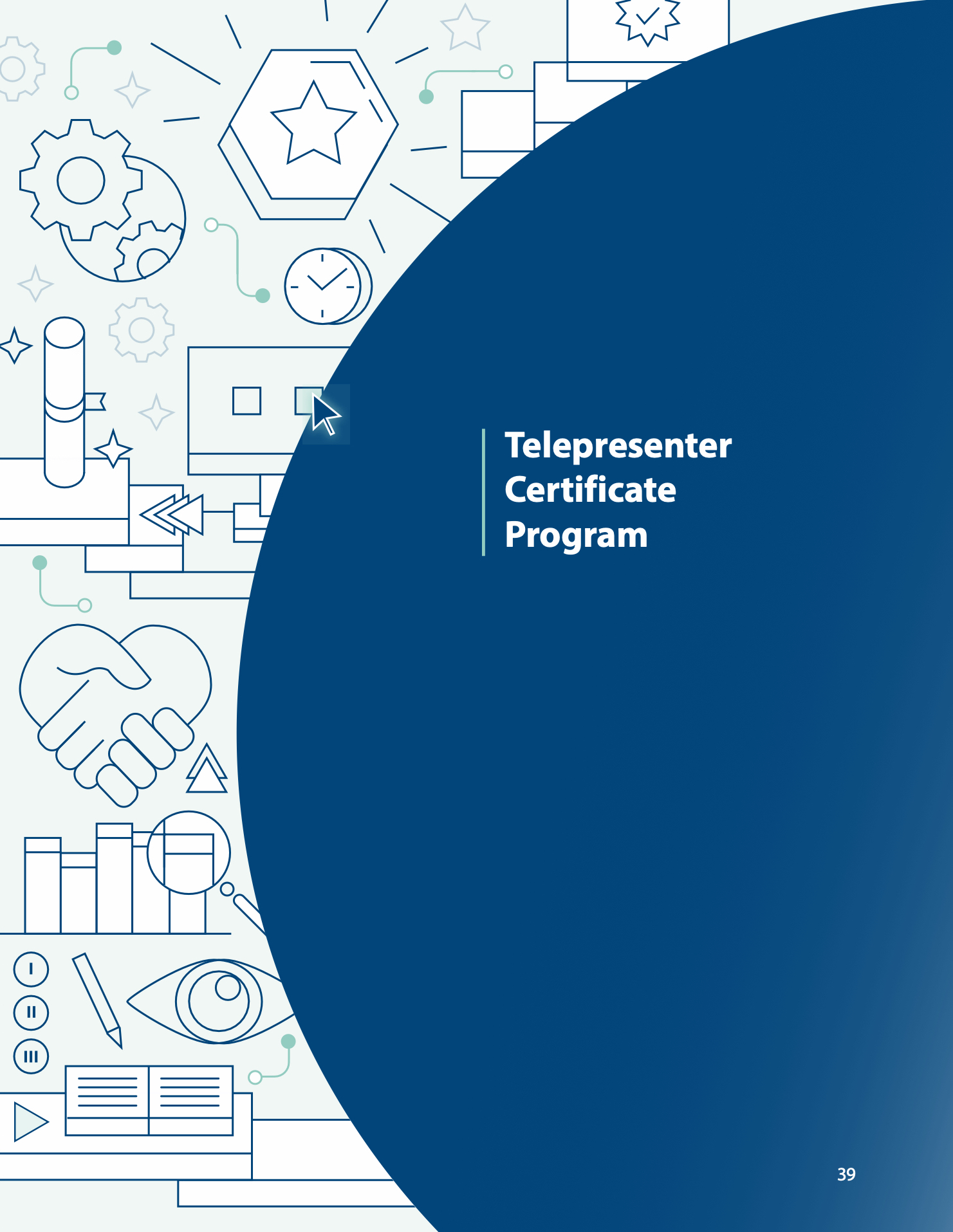
︎︎︎ Playing around with icons inspired the cover design, the idea is to give a visual introduction to the content.
︎︎︎ Expanded the icons as journey diagrams in an illustrative style, to capture multiple ideas and tell a story. I thoroughly enjoyed creating this!
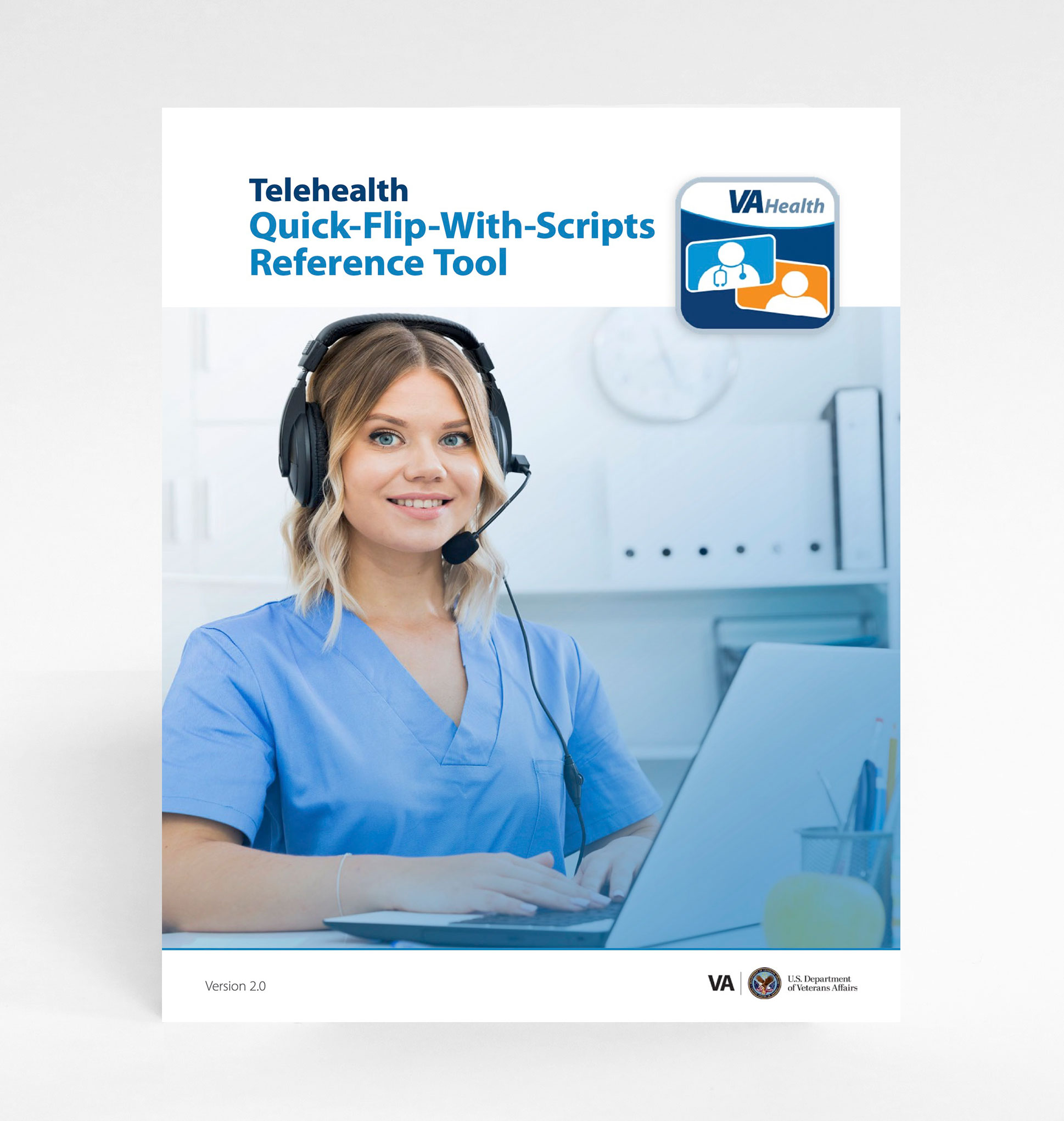
3. Interactive Flipbook
This Quick-Flip-With-Scripts Reference Tool Flipbook serves as a quick reference for Virtual Care Manager interacting with Veterans.
In order to support communications, I developed icons that was friendly and clear, with subtle shadows and gentle colors to complement the overall design of the flipbook.
︎︎︎ First glyph icons were created for short information (right).
Then I continued on to create a more detailed version of the icons for longer information (top).
Then I continued on to create a more detailed version of the icons for longer information (top).
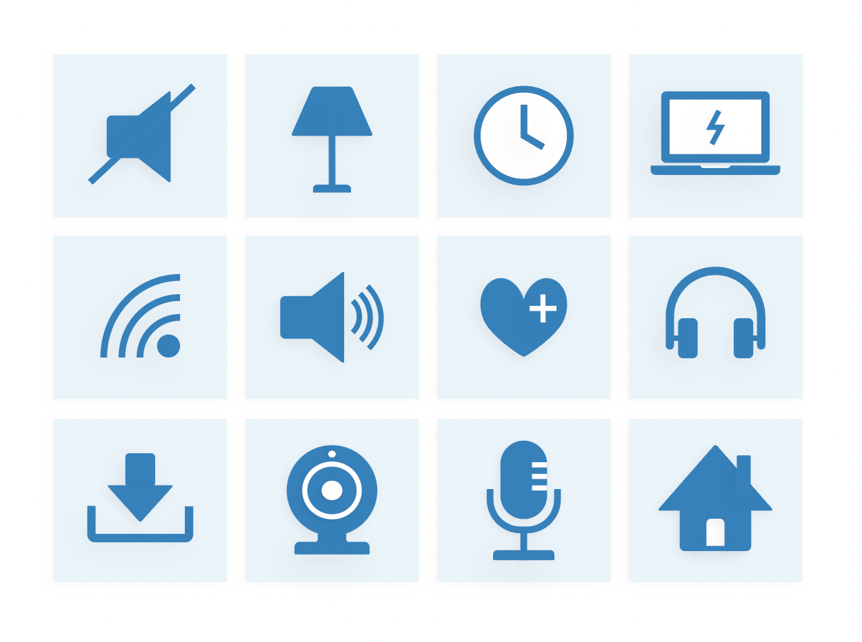
4. Outreach

Here are some additional examples of graphic illustrations I have developed for our outreach materials.
︎︎︎ Showcasing re-purposed icons, stylized for usage in other materials such as the Quality Training Newsletters.