


Jurong Spring
Format: Logo Design / Country: Singapore
In 2011, Jurong Spring constituency was formed as part of a five-member Group Representation Consituency (GRC) located in the western area of Singapore.
In 2014, Team for Member of Parliament representing the Jurong Spring ward of Jurong GRC, would like a community-based brand to bring people together that represents the new ward to promote a sense of belonging and identity.
I worked with 2 Architects in this pro-bono project, to explore both ideas of strong curve lines that derives in the shape of a ‘J’ and ‘S’, and marry it with the curved shape representing the flow of spring, which echo softness and community.
In 2022, happy to update that the logo is still being used as it was designed 8 years ago and further realised (by other designer/s) in a logo for a new town council.
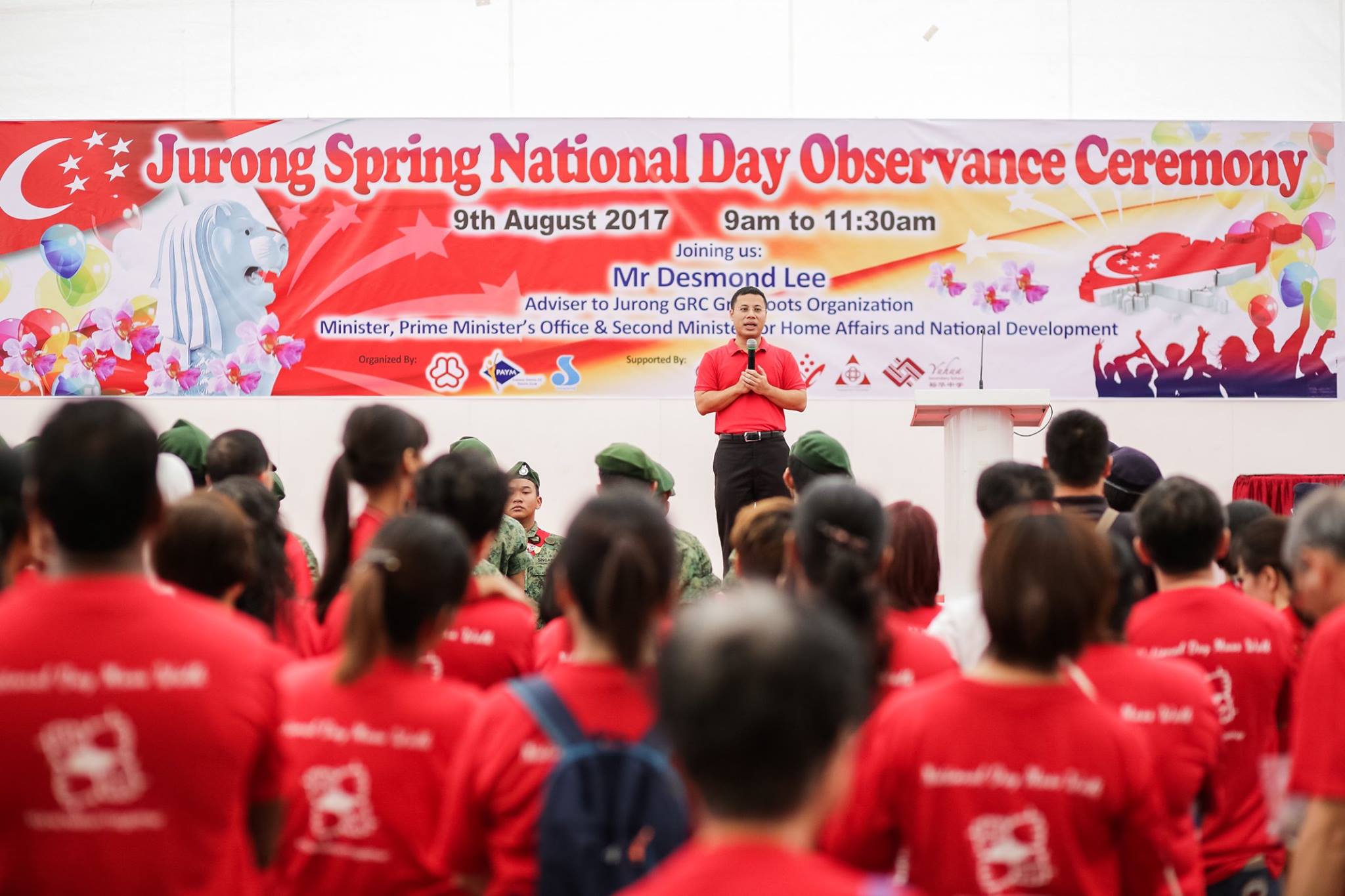
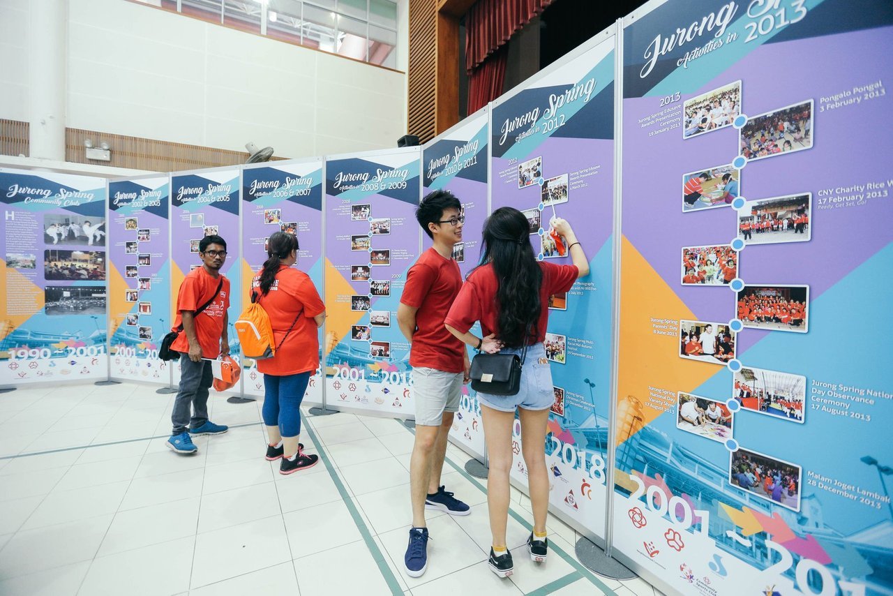
︎︎︎Jurong Spring final logo and samples of application in the community.